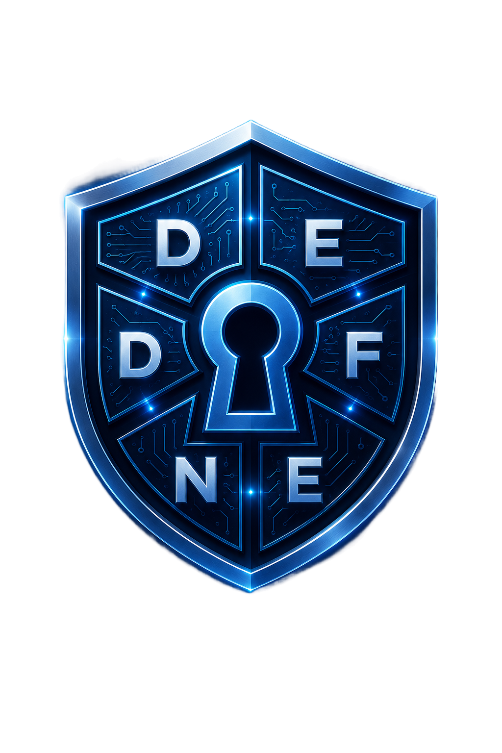
The mark
Do
- Keep clear space around the shield roughly equal to the height of the keyhole.
- Use the full-color version on dark backgrounds.
- Scale proportionally.
Don't
- Recolor, rotate, or distort the shield.
- Place it on busy or low-contrast backgrounds.
- Combine it with another organization's mark without permission.
Color system
Blue
#3b82f6 Primary accent — links, highlights, primary UI elements.
Cyan
#22d3ee Interactive accent — badges, active states, glow effects.
Teal
#2de1c2 Secondary accent — outcomes, stats, positive emphasis.
Ink (background)
#04070f Base background — deep navy-black.
Text hi
#e8eefc Headings and emphasized text.
Typography
Space Grotesk — display & body
DEFEND Digital Life
JetBrains Mono — labels, code, badges
WORKING DRAFT · DEF-EM-DN-1.1
Voice
Honest over impressive
State exactly what's true — draft status, real limitations, no inflated claims.
Plain language first
Explain the human benefit before introducing a formal term.
Calm, not fear-based
DEFEND informs; it doesn't scare people into action.
Specific over vague
Real numbers and named examples beat generic reassurance.